It's now 201 days ago, on a sunny summer day in Ardèche, France, that I last redesigned this website.
But in recent months I've started to want a new look for it. I liked the custom font I was using—Fern from David Jonathan Ross—and the styles were unique, but over time I became weary of them.
I wanted a refreshed, simpler, subtler look that would not distract from browsing and reading.
Here's a before/after comparison (in dark mode) of what I came up with:
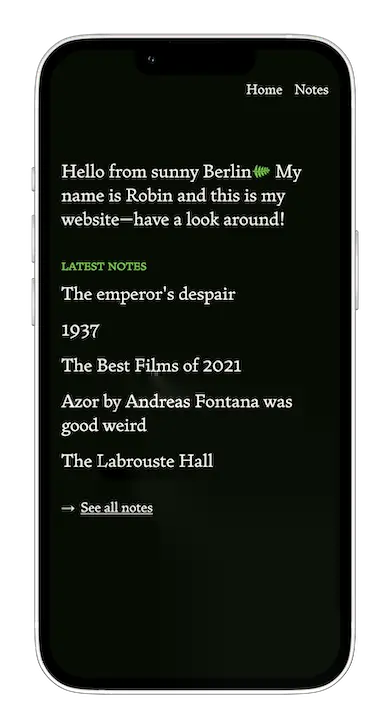
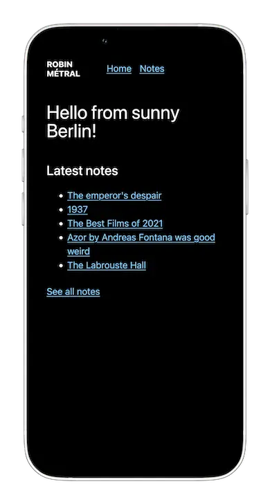
In a nutshell, the new styles move away from custom colors, typefaces, and layouts; and embrace the simplicity of a black-white-blue theme, system fonts, and web platform defaults (for example bulleted lists).
Although still a work in progress, I already like the cleaner, simpler styles, which also cut page size down by 95%1.
The redesign also pairs well with my recent move away from Astro and towards my own (WIP) static site generator, brut, which focuses on simplicity and web platform defaults.
Let's see how long this look lasts! Before: 89kb homepage—77kb fonts (Fern variable regular) and 8.5kb CSS (5kb from Tailwind's CSS reset). After: 5kb homepage—0kb fonts (system fonts), 2kb CSS. ↩Footnotes